Do you remember my last year’s post on Pantone colours of the year 2016, published here? In 2016, Pantone suggested rose quartz and serenity, as a colour combination leading towards “… gender equality, wellness and peace“. Well, we shouldn’t start any discussion on how rose quartz and serenity really contributed to world peace, but let’s hope that GREENERY, the new colour for 2017 will help us “… to take a deep breath, oxygenate and reinvigorate” (see: “Introducing Greenery” by Pantone, here).
Looking back at my own usage of greenery in watercolours, I noticed that so far, it has not been very prominent in my paintings.

The Australian Parrot, watercolour on Arches 300 gsm, 22 x 32 cm (painted in April 2013)
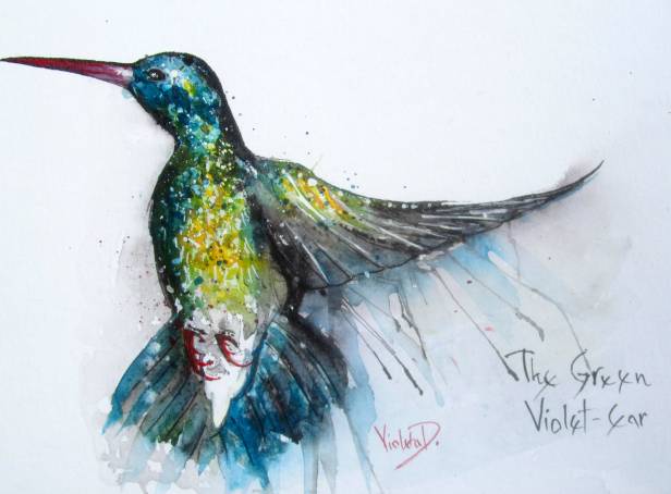
The Green Violet-Ear, watercolour on Hahnemühle 425 gsm, 29 x 39 cm (December 2013)

Alfia, watercolour on Arches 300 gsm, 24 x 32cm (Painted in May 2014)

The Kaisar-I-Hind, watercolour on Hahnemühle 425 gsm, 30 x 40 cm (November 2014)

Kissing Humingbids 1, watercolour on Hahnemühle 425 gsm, 30 x 40 cm (Dec. 2014) (private collection, UK)
8.34 A.M., watercolour on Hahnemühle 425 gsm, 30 x 40 cm (March 2015) (private collection, USA)
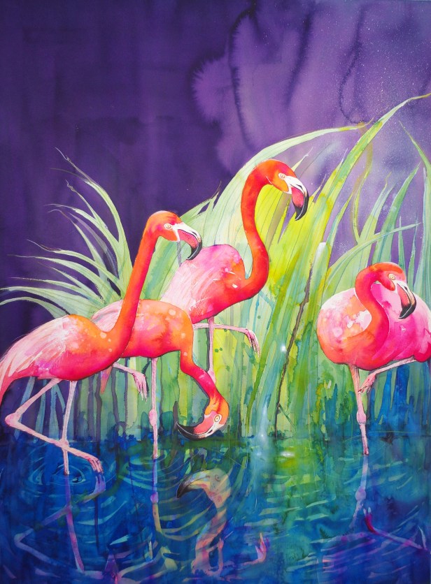
Flamingo Night, watercolour on Arches 300 gsm, 110 x 145 cm (May 2015)
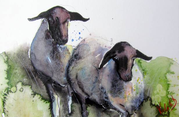
Domestic Sheep, watercolour on Hahnemühle 425 gsm, 19,5 x 24,5 cm, (November 2015)

More Figs (a detail from the painting), watercolour on Hahnemühle 425 gsm, 30 x 40 cm (November 2015)

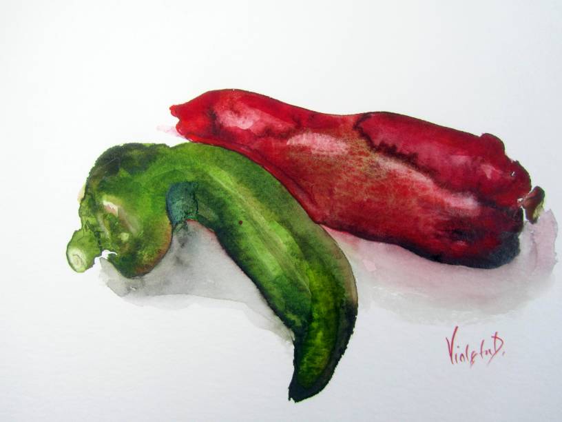
Paprika, watercolour on Hahnemühle 425 gsm, 24 x 30 cm (October 2016)
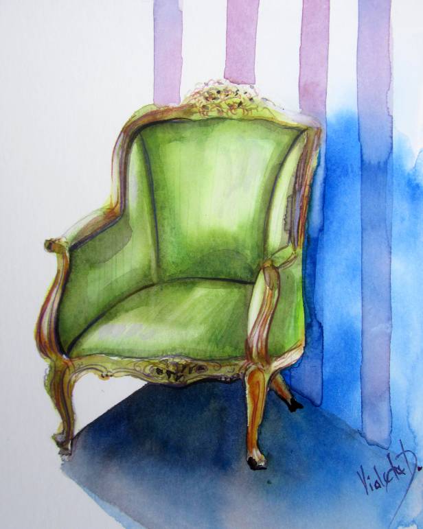
The Armchair in Olive Green, watercolour on Hahnemühle 425 gsm, 30 x 40 cm (Dec. 2015)

The Koala, watercolour on Hahnemühle 425 gsm, 30 x 40 cm (December 2016)
Finally, I even found a few small abstracts in greenery!


wonderful group! love the chili peppers, and that red one, wow, really keeps drawing my back to It! love it 🙂
LikeLiked by 1 person